Blog / Affiliate marketing
How to Design a Landing Page That Converts in 2026?
Landing page design determines whether visitors convert or leave within seconds. A high-converting page combines clear visual hierarchy, a single focused call to action, fast-loading images, and trust signals such as customer reviews. Proven principles — the rule of thirds, Hick's law, and the F-pattern — decide where to place key elements so users notice them first.
This guide breaks down seven design tricks and seven UX rules that make a landing page easier to scan, faster to load, and more likely to convert. You will learn exactly where each element belongs.
What you'll learn from this article:
which visual psychology tricks make visitors notice your key elements first,
how to limit choices so users decide and act faster,
where to place headlines, images, and CTAs above the fold,
which UX rules cover color, spacing, accessibility, and footers,
how to keep your landing page fast, accessible, and SEO-friendly.
What landing page design tricks boost conversion?
Landing page design relies on visual psychology: people scan pages in predictable patterns and act faster when their choices are limited. The most effective tricks position the headline, image, and call to action where the eye lands first, reduce decisions to a single goal, and capture attention within the first eight seconds.
If you have not built the page itself yet, start with our step-by-step guide to creating a landing page and the five rules for an effective landing page. Designing the page yourself takes time, but it can save up to $5,000 compared with hiring an agency.
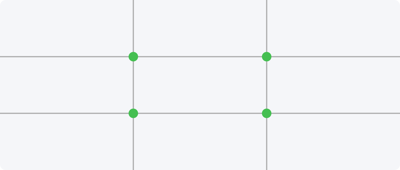
Trick 1: The rule of thirds and four power points
The rule of thirds divides a page into nine equal squares using two horizontal and two vertical lines. The four points where these lines intersect are the “power points” — the spots the human eye notices first. The most important elements, such as the headline or call to action, belong at these intersections, where they capture attention immediately.
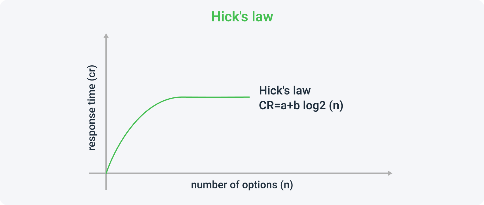
Trick 2: Hick's law — fewer choices, faster decisions
Hick's law, formulated by psychologist William Edmund Hick, states that decision time grows as the number of options increases. On a landing page, fewer choices lead to faster action. In one study, a stand offering 24 jams converted ten times worse than one with six — evidence that a single, focused CTA improves results.
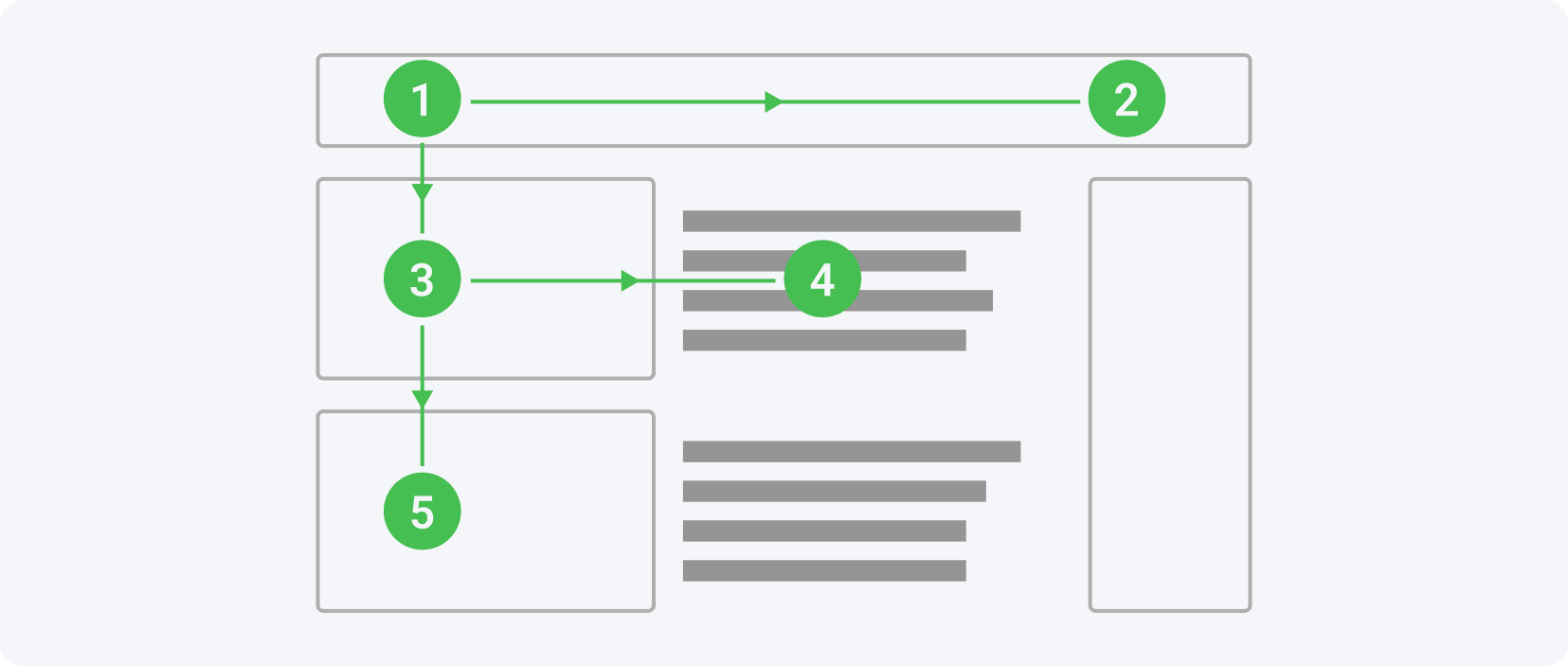
Trick 3: The F-pattern of reading
The F-pattern describes how the eye moves across a page: first left to right along the top, then down and across in a shorter sweep, with least attention on the bottom-right corner. The most important content — headline, key benefits, and contact options — performs best when arranged along this F-shape.
Trick 4: The 8-second rule
The 8-second rule reflects how long an average visitor's attention lasts before leaving a landing page — and recent research suggests even less. Winning those seconds depends on a headline that names the benefit and the problem it solves, a supporting image, and one short, visible call-to-action button placed where the eye lands.
To win those seconds, keep three things tight:
Make the headline catchy and specific — state the product's advantage and the problem it solves.
Support the message with an eye-catching image that conveys the main purpose at a glance.
Add one short, visible CTA button that stands out from the rest of the page.
Trick 5: The law of similarity
The law of similarity states that people perceive the overall structure of a page differently from its individual elements and mentally group items that look alike. On a landing page this means related elements sit together — a sign-up form or order button placed right next to customer reviews reinforces trust and credibility.
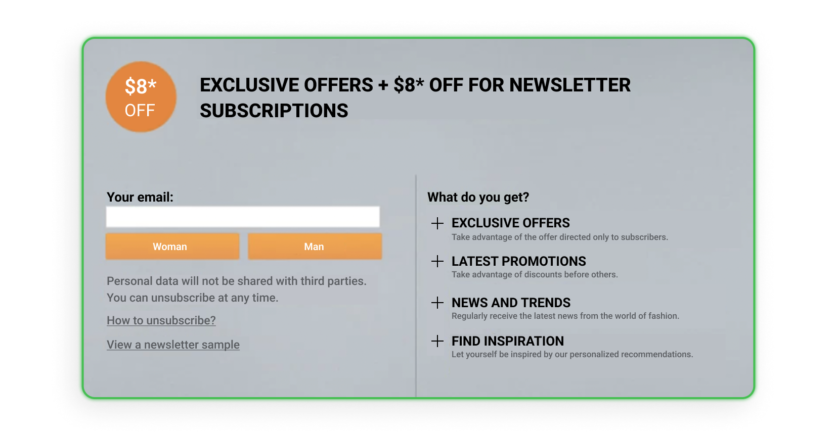
Trick 6: Social proof and reviews
Social proof covers reviews, certificates, and diplomas that signal others trust an offer. A study by Data Insight and AliExpress found that nine out of ten purchases are finalized after the customer reads reviews. Genuine customer reviews on a landing page therefore raise credibility and move hesitant visitors toward conversion.
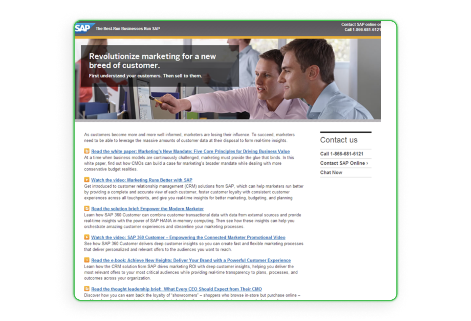
Trick 7: Above the fold
“Above the fold” is the part of a page visible without scrolling. Nielsen Norman Group research proved that content above the fold is 84% better received than content below, because scrolling demands extra effort. The headline, core offer, and primary CTA therefore perform best above the fold, with longer, less-seen content placed lower.
Ready-made layouts speed this up. Browse high-converting prelander templates to see how top affiliates structure the above-the-fold area before users scroll.
How should you design landing page layout and UX?
Landing page UX starts with the target group: their age, interests, goals, and expectations decide the colors, tone, and layout. Once the audience is clear, consistent rules for images, color, headlines, accessibility, spacing, menus, and footers turn a rough vision into a page users navigate effortlessly. The seven rules below cover each area.
Mapping real user needs first is the core of empathy-driven UX design. Decide whether your audience responds to calm pastel tones or bold, dark ones, then keep every element consistent with that choice.
Rule 1: High-quality images
High-quality images shape first impressions and conversion. One Bright Local study found that 60% of people prefer search results containing images, while Skyword research recorded 94% more impressions for content with interesting visuals. Generic stock photos weaken impact, so original, relevant visuals perform better. Several sites offer high-quality photos for free.
Pexels
Unsplash
StockSnap
Negative Space
Superfamous Studios
Little Visuals
Gratisography
Kaboompics
Picjumbo
Image size also affects user experience: page speed depends on how heavy your images and videos are, so compress them as much as possible without losing quality. For Windows, these compressors help:
Riot
File Minimizer Pictures
Caesium Image Compressor
File Optimizer
Pingo
JPEG mini
For macOS, the best options are:
JPEG mini
ImageOptim
TinyBeest
Photo Size Optimizer
Online image compressors:
TinyJPG
Compressor.io
Kraken.io
Video size matters even more — photos weigh a few MB, but videos often exceed a hundred MB and can slow your page badly. The best video compressors are:
Any Video Converter Free
Leawo Prof. Media
Freemake Video Converter
WinX Video Converter
MediaCoder (Windows only)
AVS Video Converter (Windows only)
Total Video Converter
HandBrake
Rule 2: Colors
Colors in marketing carry weight and shape how users perceive a brand, so deliberate selection matters. Brand colors work best aligned with the mission and the target group's taste. For accessibility, two bright colors side by side — especially blue and green — challenge color-blind users, while black on white stays the most readable combination.
Your offer and service quality still matter most, but color choices reinforce them. Learn how individual shades influence behavior in our guide to the psychology of color in affiliate marketing.
Rule 3: Bright and clear headlines
Clear, unobtrusive headlines help users remember a page and return to it. A bright, legible headline guides visitors through the content and eases use for people with disabilities or those digitally excluded. Short, high-contrast, descriptive headlines register during a quick scan, so the main message lands within the first moments of attention.
Rule 4: Accessibility for people with disabilities
Accessibility lets people with disabilities navigate a page and improves SEO, which lifts ranking in Google and other search engines. Built in from the start, it relies on descriptive ALT text, video subtitles, clearly marked links, large clickable buttons, and logical keyboard navigation. The list below covers the essentials for every landing page.
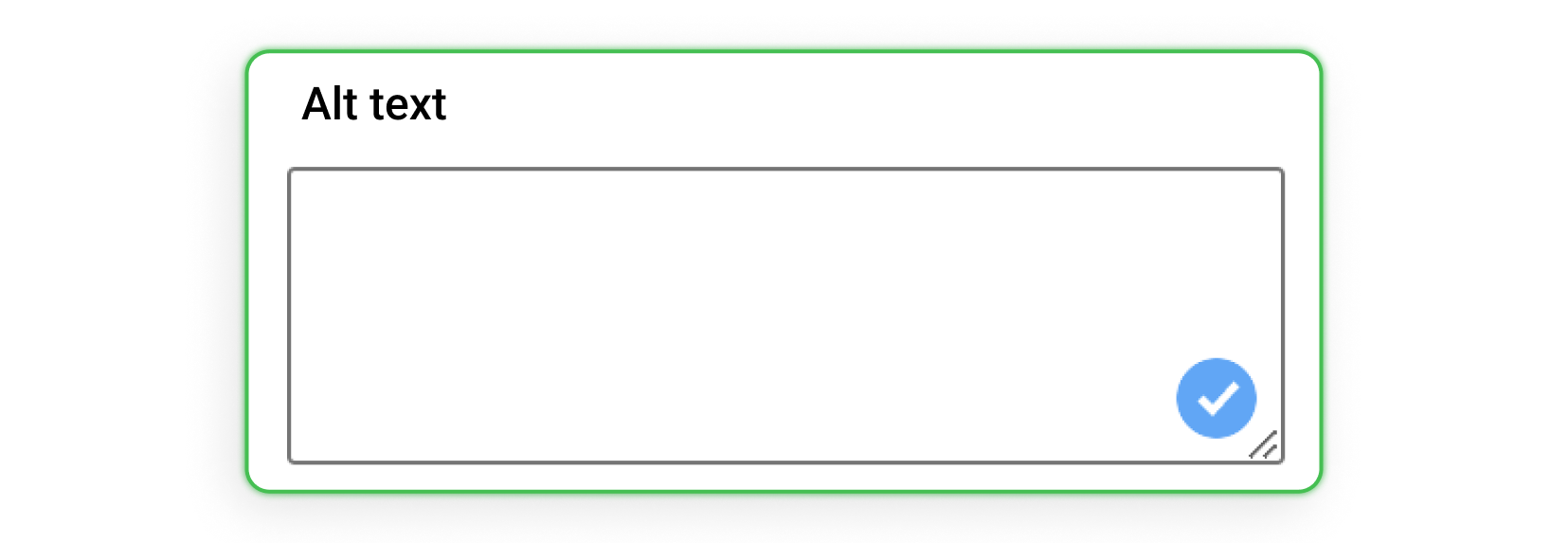
ALT descriptions — alternative text that screen readers announce and that appears when an image fails to load.
Subtitles for videos — captions that help deaf users; transcribe longer audio recordings.
Properly marked links — descriptive anchors instead of “click here,” highlighted in a distinct color.
Button size — clickable areas large enough for users who struggle to navigate precisely.
Keyboard navigation — the TAB key moves logically from the address bar through the menu and page areas.
Accessible markup and clean structure also feed search engines. See our landing page SEO optimization tips to turn these accessibility gains into better rankings.
Rule 5: Space
White space lets users grasp a page quickly and without effort, so they immediately know what it offers. The cluttered 2010-style layout packed with text and ads leaves visitors unsure what to do next. Elements with room to breathe and a clean header carrying simple information set clear expectations from the first glance.
Rule 6: Transparent menu and symmetry
A transparent menu matters as much as a simple header. Today's standard is a single main menu bar at the top — clear, predictable, and easy to navigate. A symmetrical layout reinforces this, because the human eye strongly prefers balance. Together they reduce friction and keep visitors focused on the offer.
Rule 7: Footer
The footer works best thoughtful, simple, and useful. Most users who scroll to the bottom look for contact details, so the footer centers on that while still supporting business goals. Beyond contact information, it can hold navigation, links to social media, or a newsletter sign-up that matters to the page owner.
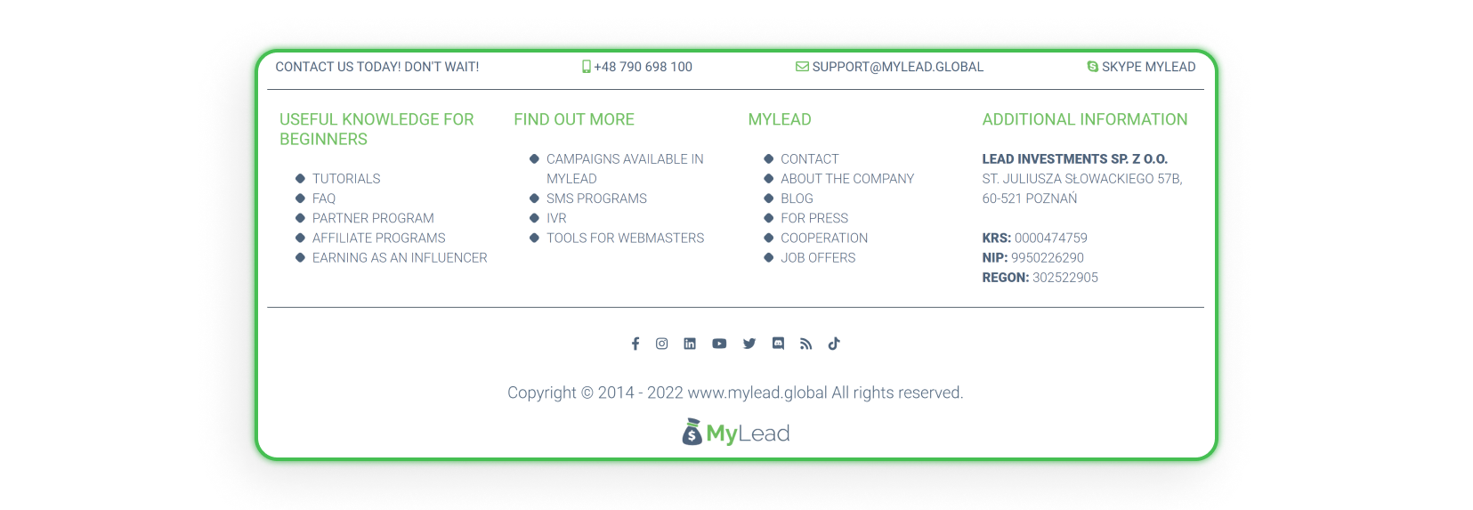
A landing page footer usually contains:
Privacy policy and terms of use,
Contact details,
Navigation links,
Links to social media,
Newsletter subscription.
What text content should a landing page include?
Landing page text content must connect to the promoted offer and guide visitors toward purchase. Hierarchy and order matter — every block in its place — answering the core questions of what the product is and why the user needs it. On lead-generation pages, short, minimal steps lift conversion the most.
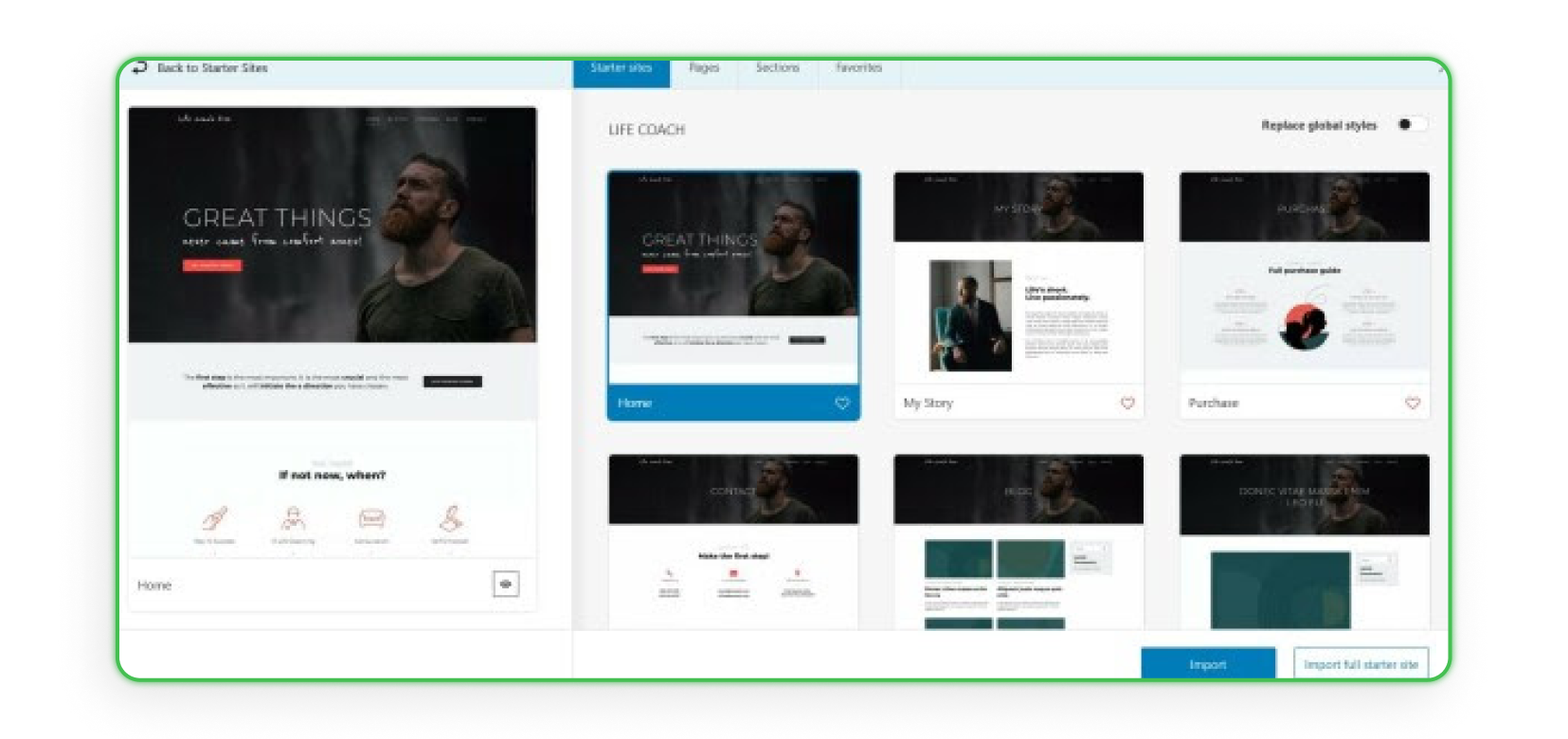
Sketch the structure in PowerPoint or on paper first, then add credentials to build trust. Page builders speed this up: Kubio, for example, extends Gutenberg so you can design entire pages in one interface without learning the WordPress template structure.
Main features of the Kubio builder:
create entire pages in a single, intuitive interface,
advanced design and responsive options,
build pages by combining pre-defined sections,
a vast template gallery for a quick start,
an extensive block library with pricing tables, galleries, sliders, and accordions.
Once your landing page is live, optimize every version with data. Test your landing pages with MyLead's Smartlinks and A/B testing to send traffic to the variant that converts best.
Key takeaways
A high-converting landing page rests on visual hierarchy: place the headline, image, and CTA at the four power points and along the F-pattern.
Limit choices — one clear goal and a single CTA beat a cluttered page, because more options slow decisions.
You have roughly 8 seconds to hold attention, so the core message and offer must sit above the fold.
Social proof works: nine out of ten purchases follow a review, so display genuine customer feedback.
Fast, compressed images and an accessible, well-structured layout improve both UX and SEO.
Keep the footer simple and useful, leading with the contact details most visitors look for.
FAQ
1. What makes a landing page convert?
A landing page converts when it has a clear visual hierarchy, a single focused CTA, fast-loading images, and trust signals such as reviews. Placing key elements at the power points and above the fold keeps users engaged within the first seconds.
2. How many CTAs should a landing page have?
Focus on one primary CTA tied to a single goal. Hick's law shows that more options slow decisions, so extra buttons lower conversion. Keep the main CTA short, visible, and repeated only where it naturally supports the same action.
3. What is the rule of thirds in landing page design?
The rule of thirds splits the page into nine equal squares with two horizontal and two vertical lines. The four intersection points are where the eye lands first, so your headline and CTA belong there.
4. How do I make my landing page load faster?
Compress every image and video without losing quality, using tools like TinyJPG, Caesium, or HandBrake. Lighter media is the biggest factor in page speed, and faster pages keep more visitors above the fold.
5. Why does accessibility matter for a landing page?
Accessibility lets people with disabilities use your page and boosts SEO at the same time. ALT text, video subtitles, descriptive links, large buttons, and keyboard navigation widen your audience and improve search rankings.
Summary
A landing page that converts blends visual psychology, a single clear CTA, fast media, and trust signals into a layout users navigate in seconds. Apply the rule of thirds, the F-pattern, and the 8-second rule, then keep refining with data. Create a free MyLead publisher account and start monetizing your pages with affiliate campaigns.
Have any questions? Feel free to reach us through our channels.